Project Type:
At&T Center
Project Information : San Antonio, TX
Client : Ellerbe Becket
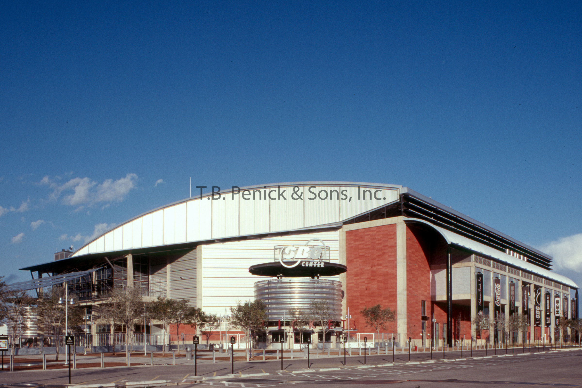
AT&T Center, home of the San Antonio Spurs, is a $186 million multi-purpose sports and entertainment complex. The design concept is a blend of South Texas culture and regional architecture. Architects, Ellerbe Becket, designed the AT&T Arena as an entertainment complex for all the family with an interactive entertainment area located on the Balcony Level along with a merchandise shop and several restaurants featuring a variety of dining choices.
Although the arena was designed from the inside out, starting with a seating bowl optimized for watching basketball, it was also designed from outside in, to establish a sense of place appropriate to its city and immediate neighbors. In several ways, the architects designed the building to encourage visual and aural connection between people and activities. In general, the architects recognized that the “event” isn’t just what happens on the arena floor, but also the social and sensory experiences surrounding it.
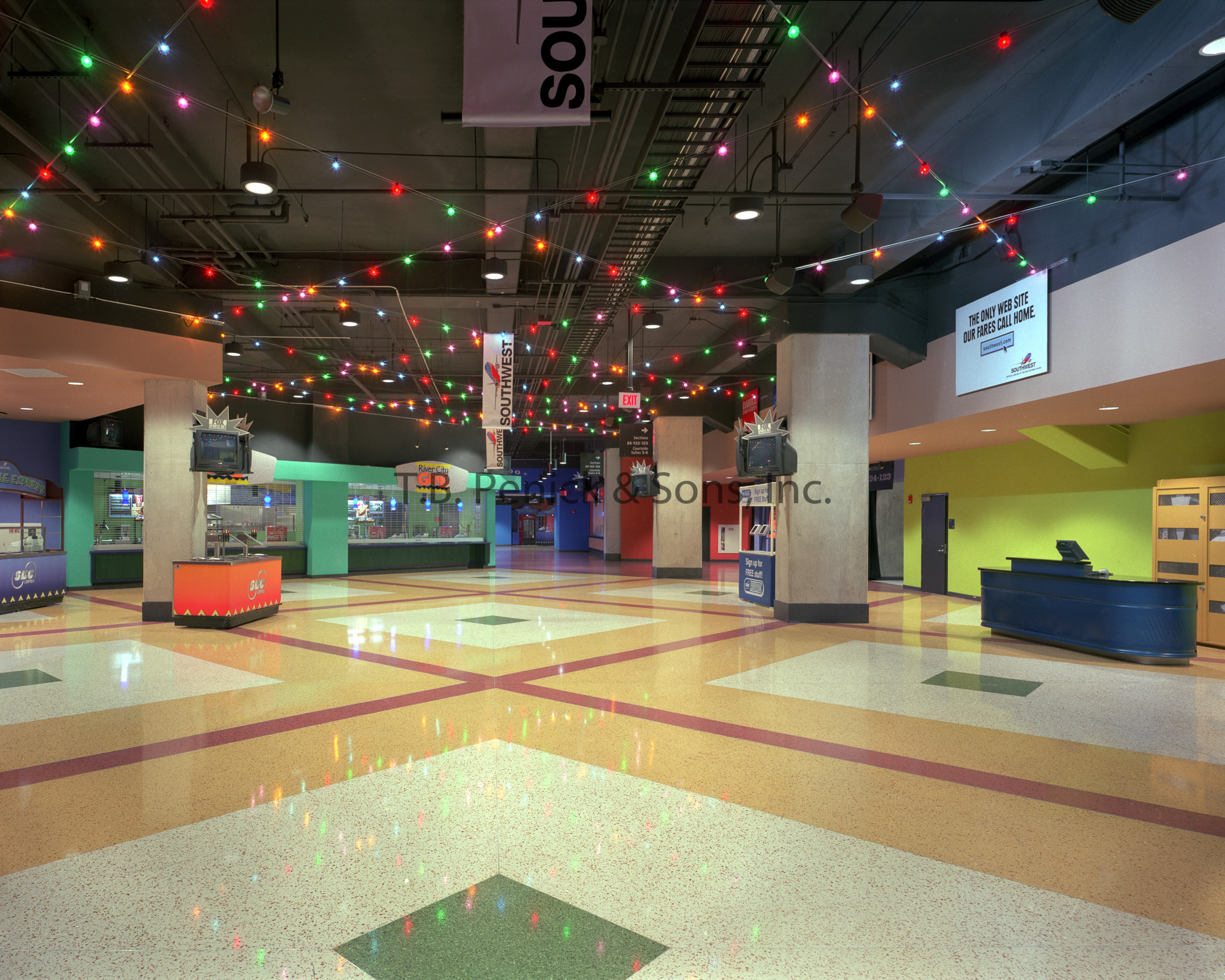
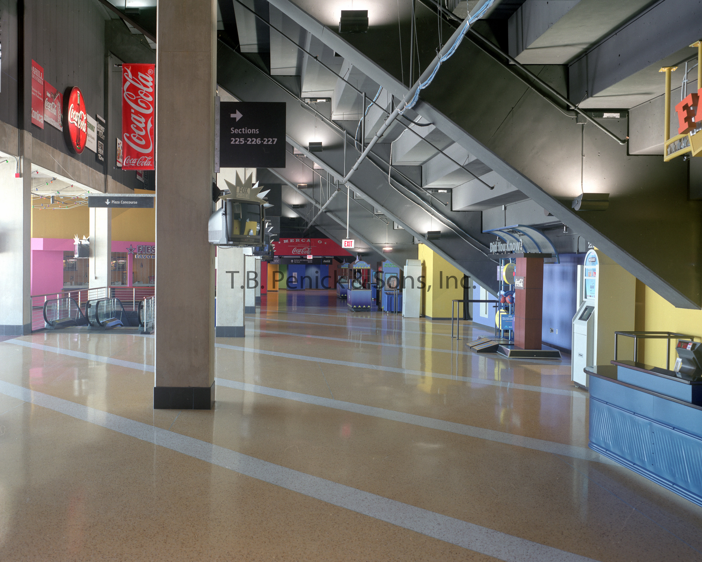
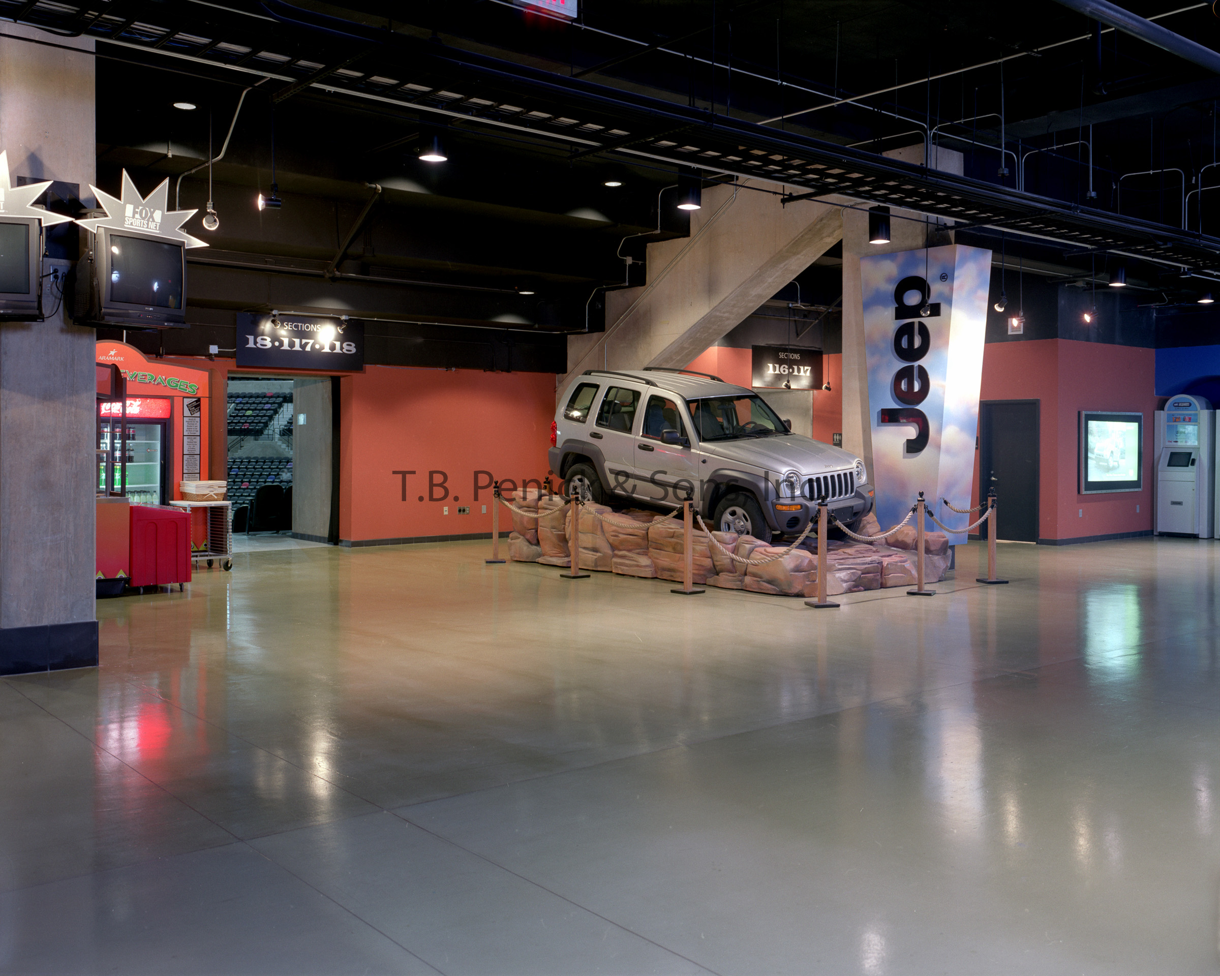
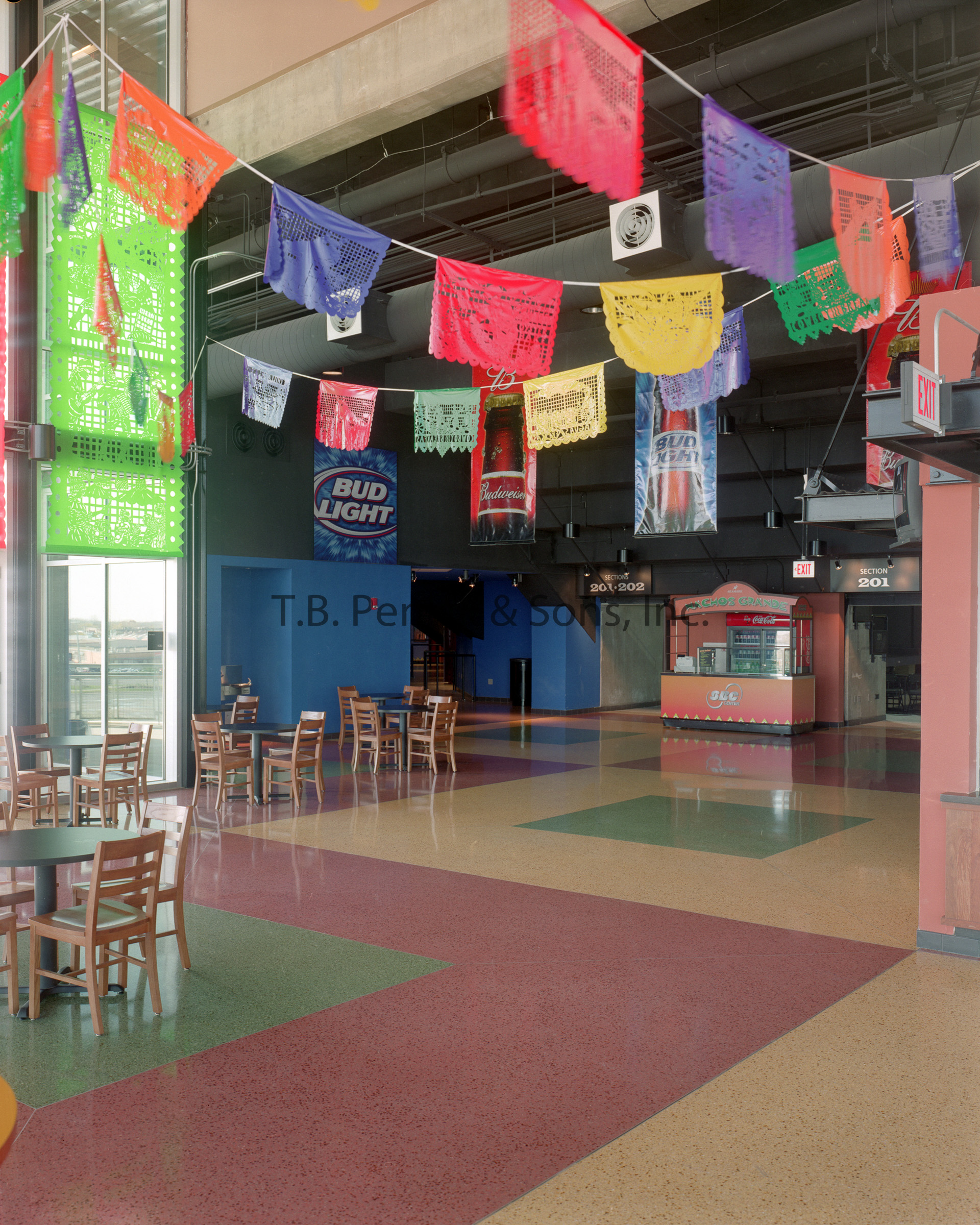
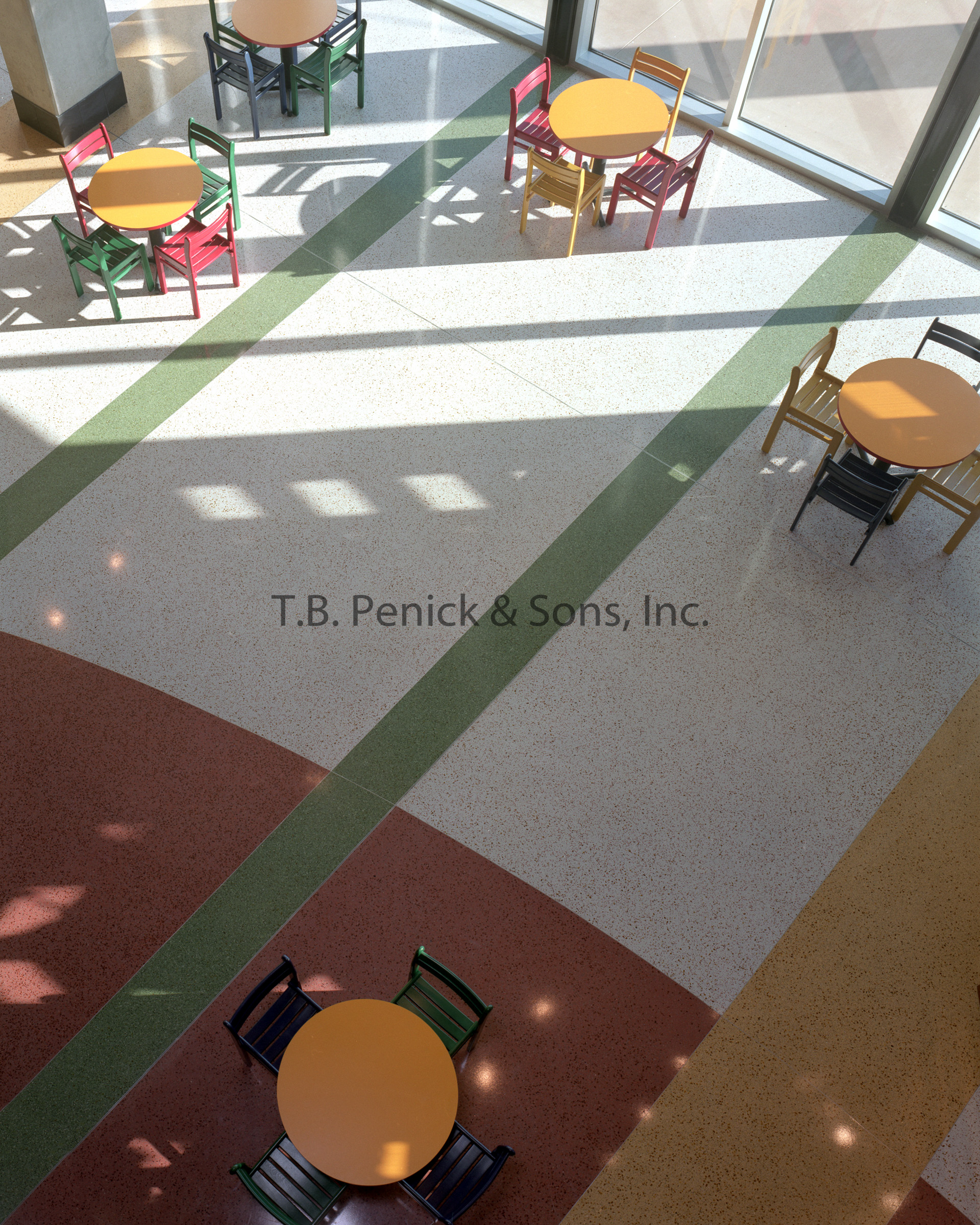
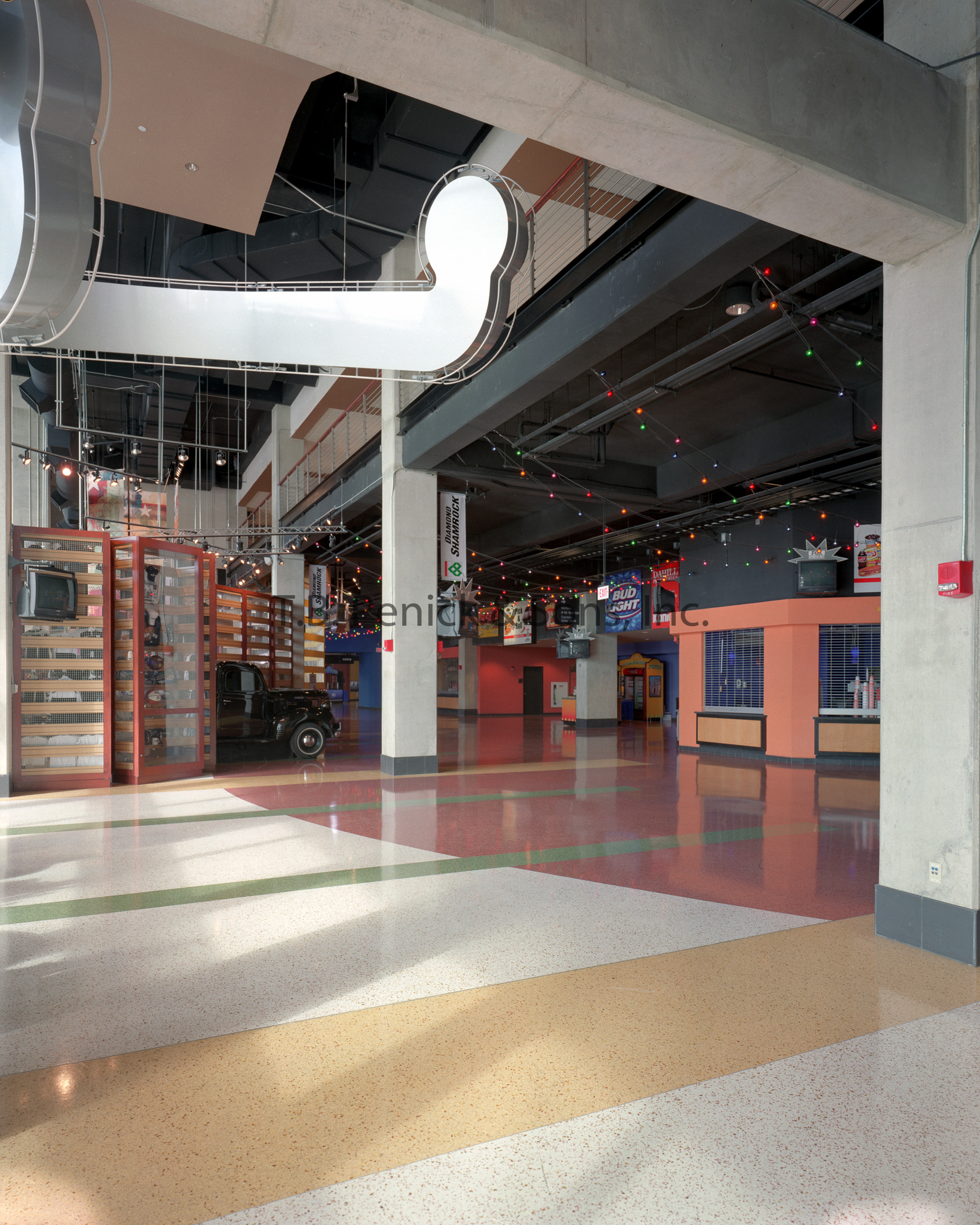
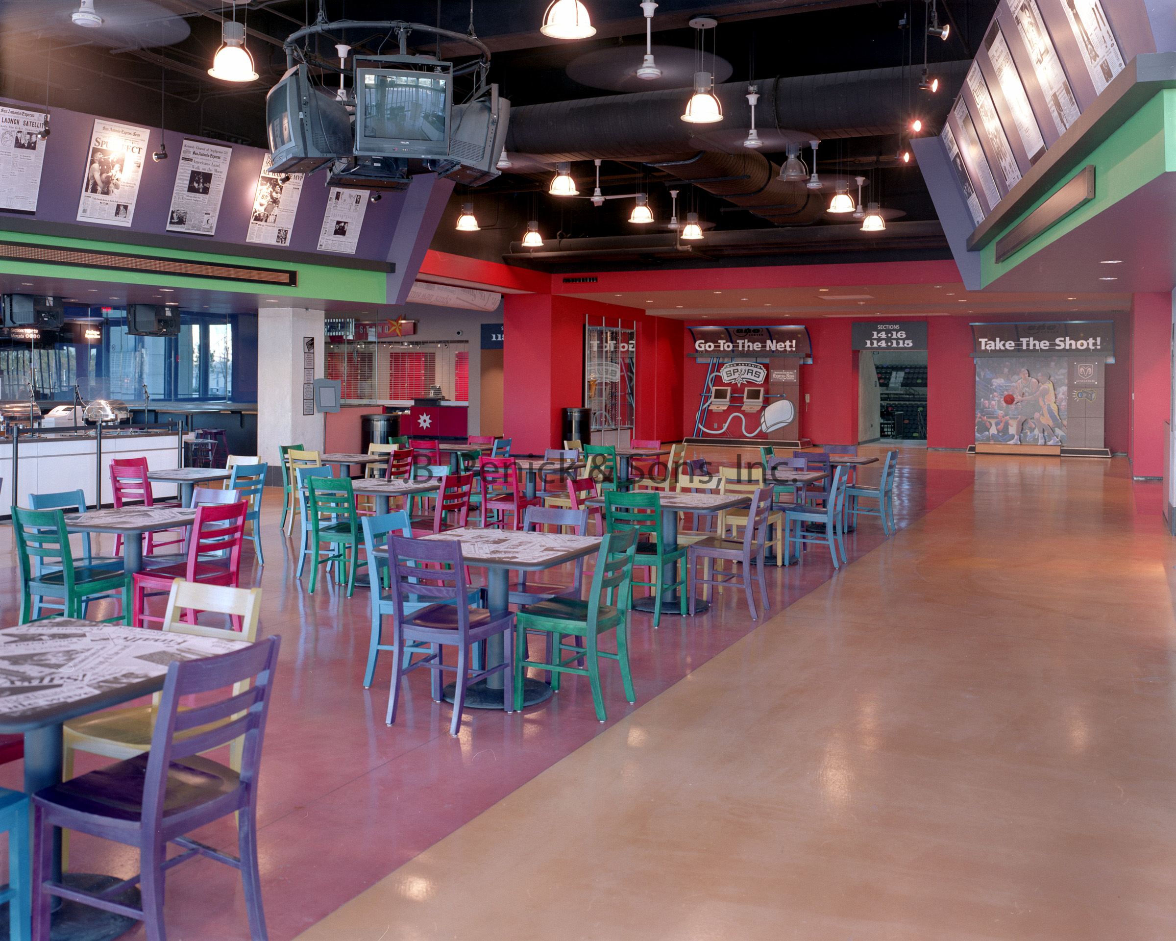
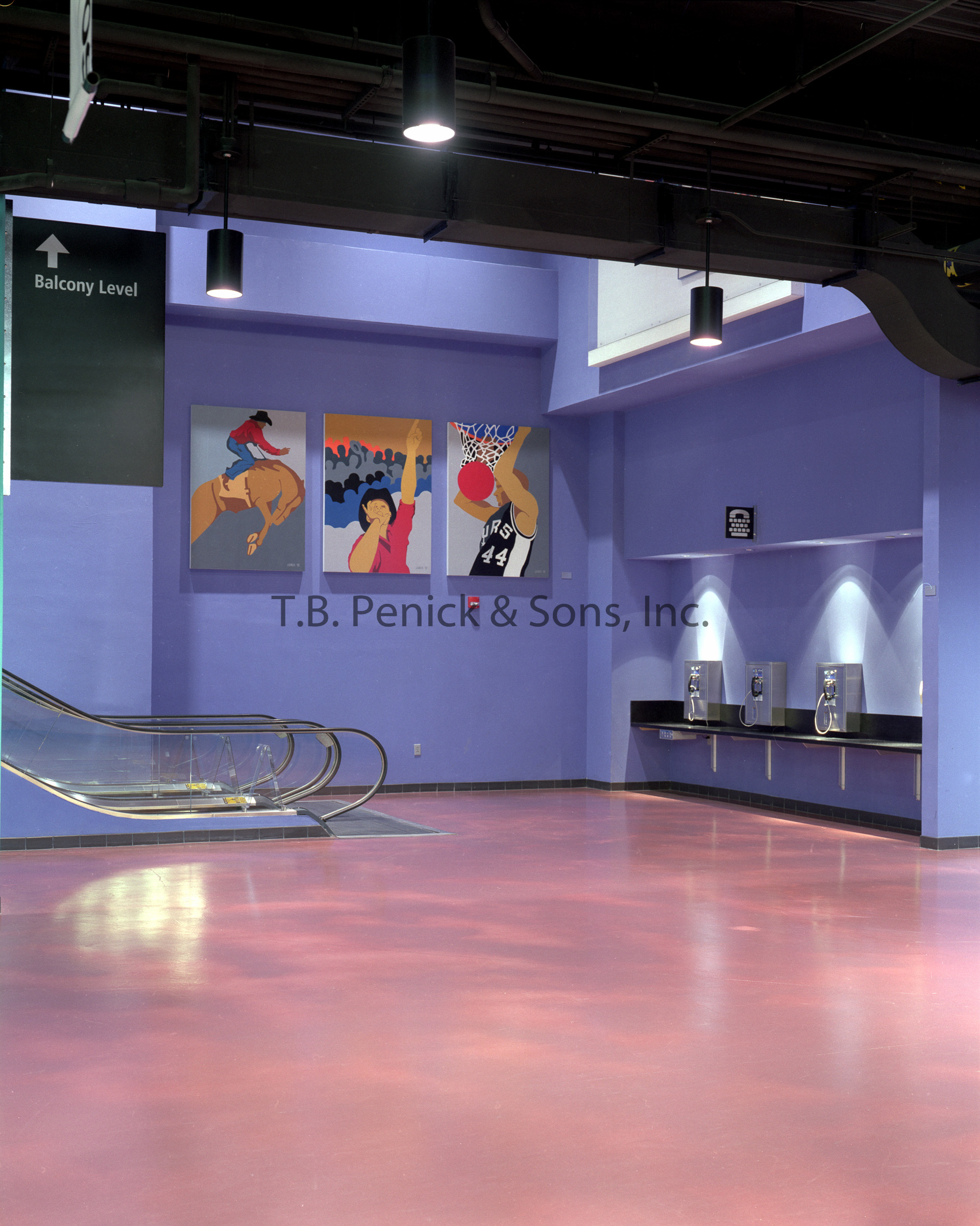
One of the mediums the architects chose to enhance the visitor’s sensory experience was the flooring. T.B. Penick & Sons, Inc. provided the AT&T Center with 30,000 sq. ft or terrazzo in various complementary colors, and 115,000 sq. ft or our Micro-Top System. Micro-Top was primarily chosen for the aesthetics, but it also served another purpose. Ellerbe Becket initially envisioned stain as the final floor finish, but the condition of the existing floor made stain a costly and time consuming path. Micro-Top supplied the architects a cost-effective and schedule friendly option to cover up imperfections in the floor done in construction, while attaining a look and color palette that they thought appropriate for the venue.
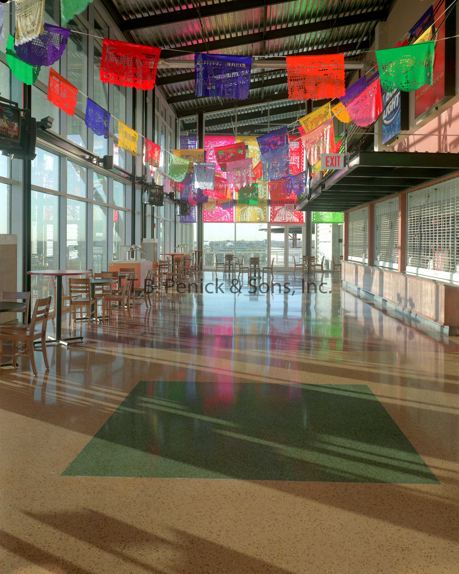
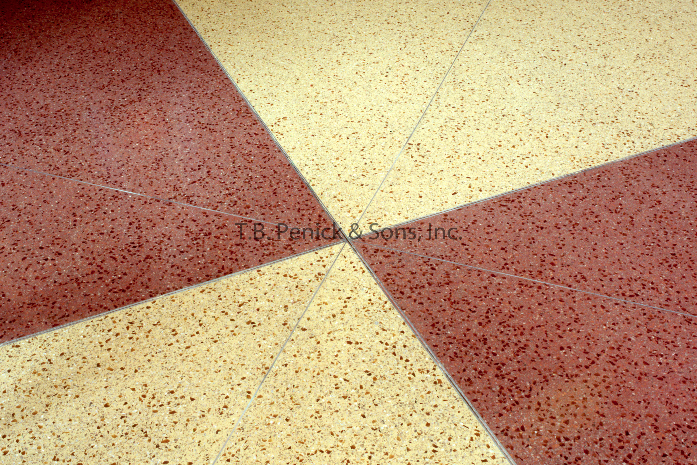
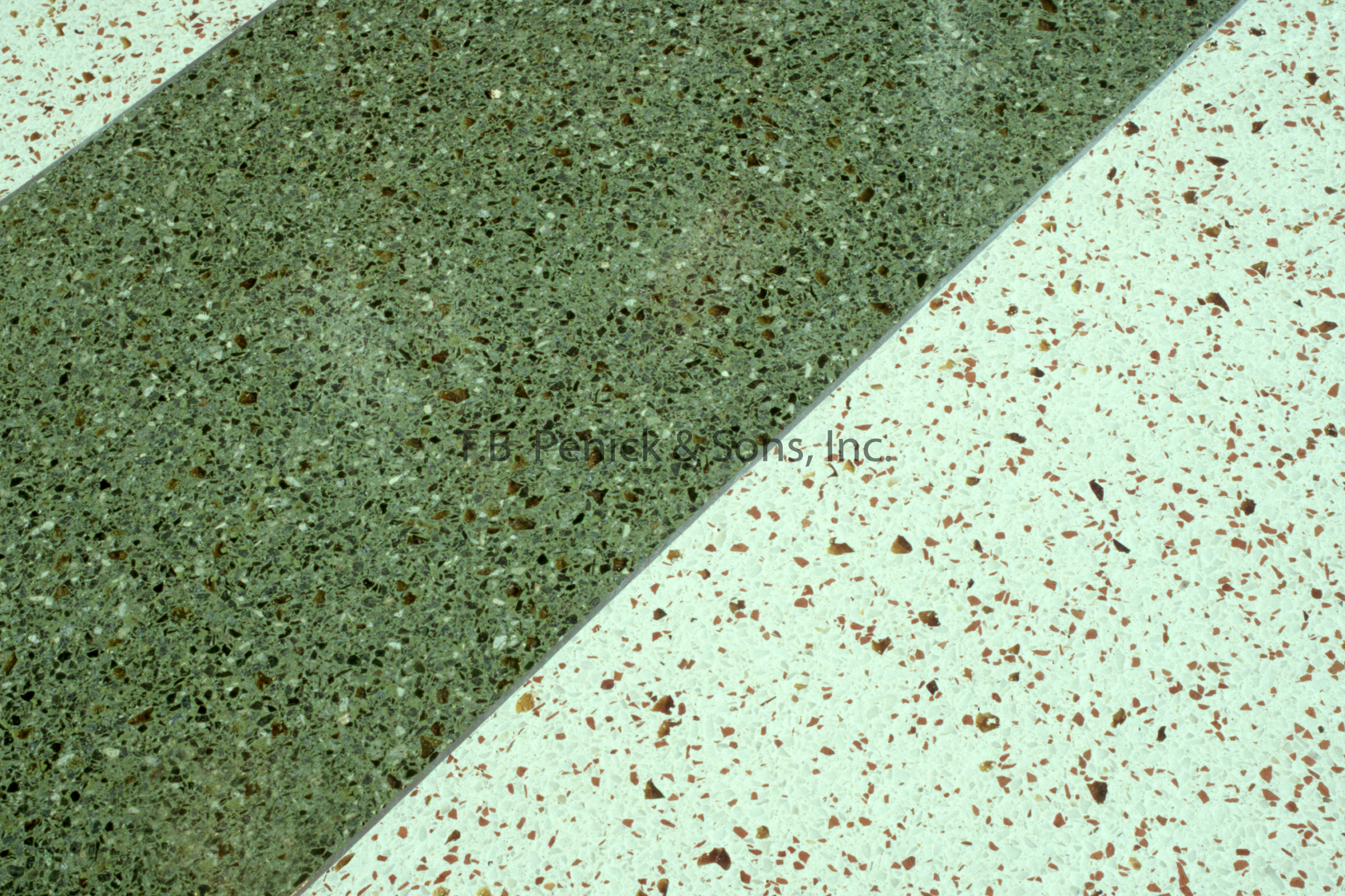
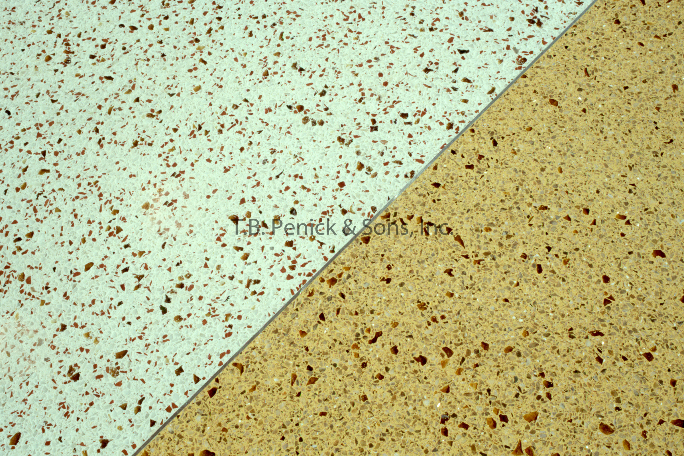
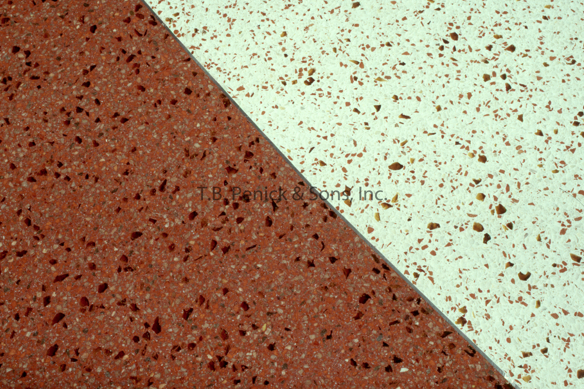
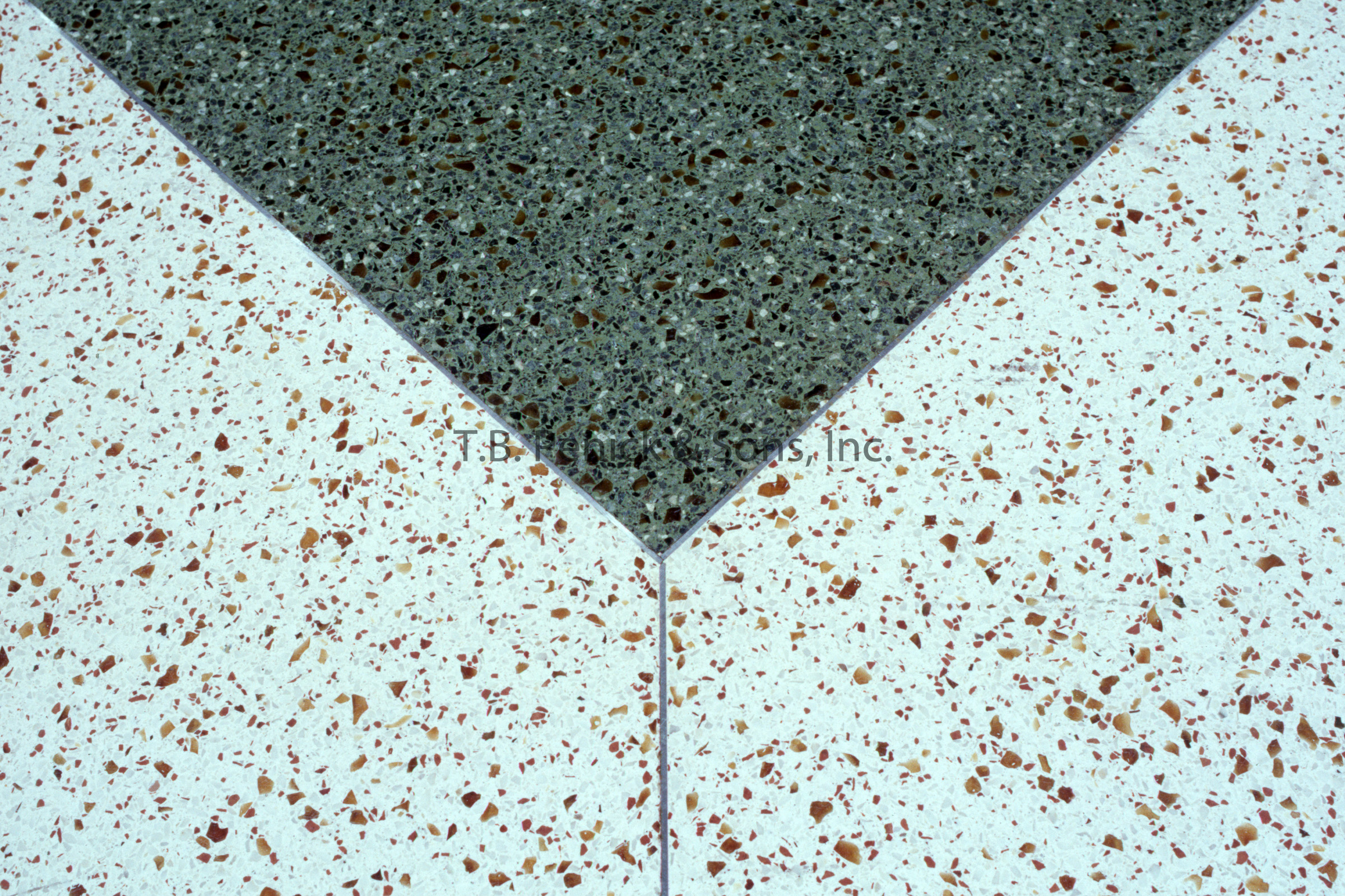
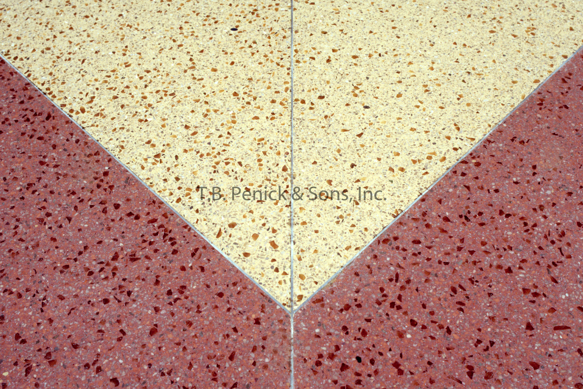
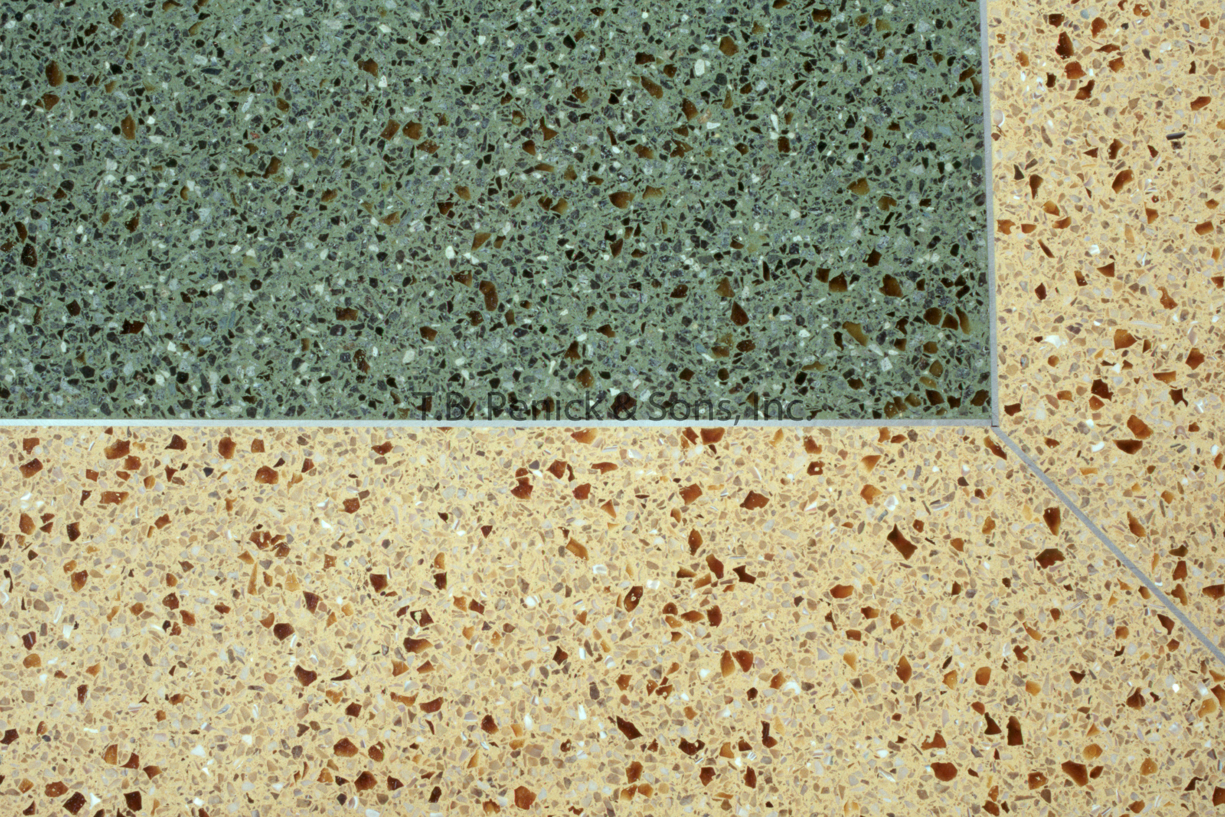
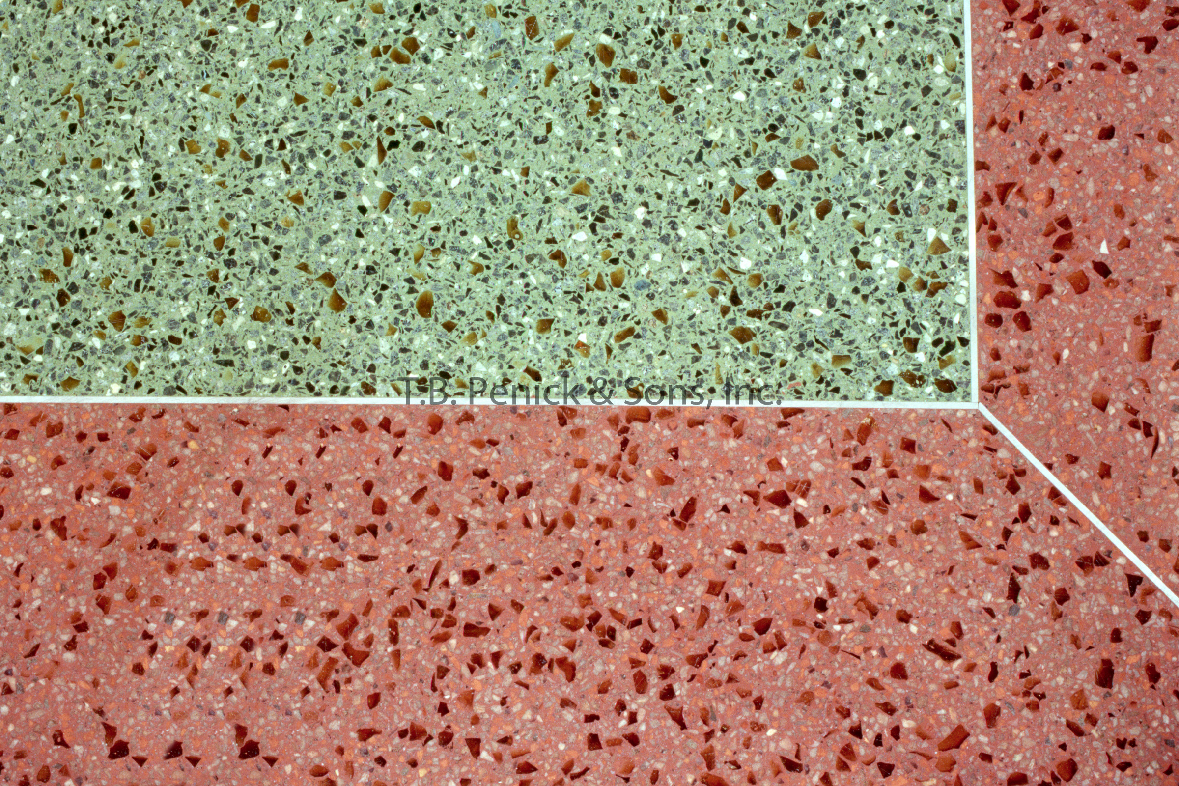
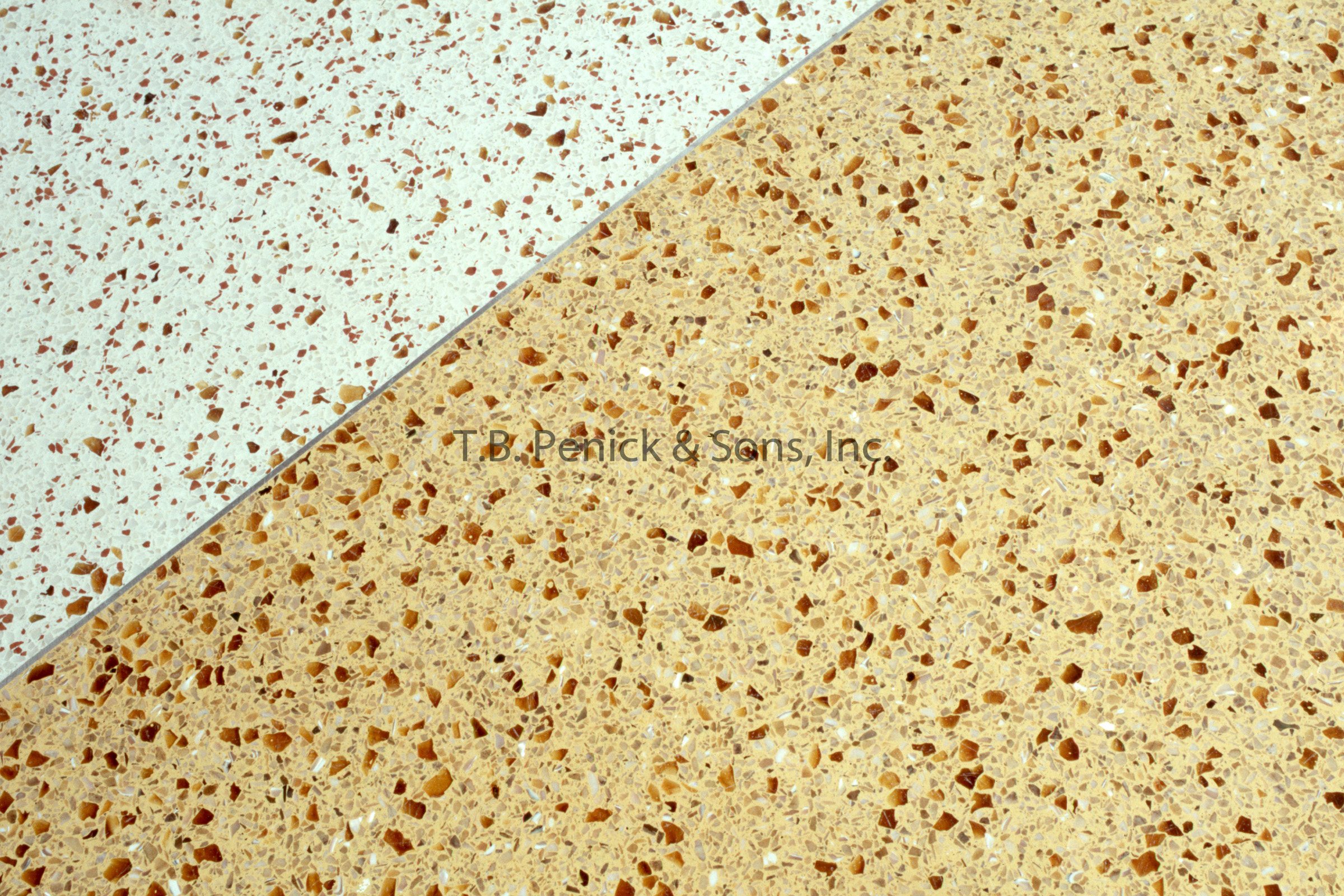
Terrazzo in various colors and patterns can be found on both the plaza and balcony levels. Golden Yellow terrazzo and Green with Amber Glass terrazzo contrast with the Terracotta and White Confetti in a bold geometric pattern found at the South Mercado on the Plaza level. In the North Mercado, small square accents of Green terrazzo where added in the center of each square of White terrazzo. On the balcony level, diagonal bands of white confetti run through Golden Yellow terrazzo. The terrazzo grand entrance spaces are sophisticated with large-scale artwork, while the majority of the building is less formal, more spontaneous. The approach was variegated, and subtle. The color palette chosen directly correlates to the influence of the Colonial and Mexican. The color patterning contrasting with the terrazzo was significant to conveying a look and feel that was specific and unique to San Antonio.


